The situation
Phantom Works is the advanced R&D unit within Boeing, dedicated to experimenting and taking risks. The organization captures and develops new programs and systems such as hypersonic and unmanned vehicles, and consists of multi-disciplined Technology Teams, which are focused on sharing common technological advancements company-wide.

The “Phantom Man”
An opportunity for change
Research has shown that although the Phantom Works name enjoys strong alignment with Boeing, the "Phantom Man" symbol used to identify the organization did not resonate as strongly in many parts pf the world and may, in fact, diminish positive associations with Boeing. The symbol's association with Phantom Works goes back to the early 1980s and the days of the original Phantom F-4 aircraft. However, looking to the future of Phantom Works as a global innovator, it was clear that the organization was due for an updated identity that better aligned with the overall Boeing brand and was potentially more appealing to a global customer base.
The approach
The Creative Team identified attributes or concepts that capture the unique talents of the Phantom Works personnel and what they do. These attributes became a useful tool in creating communications that support the mission and strategies of Phantom Works. Graphic elements and messaging contained in Phantom Works communications would be held to a standard that evoked these attributes in vivid, memorable ways.
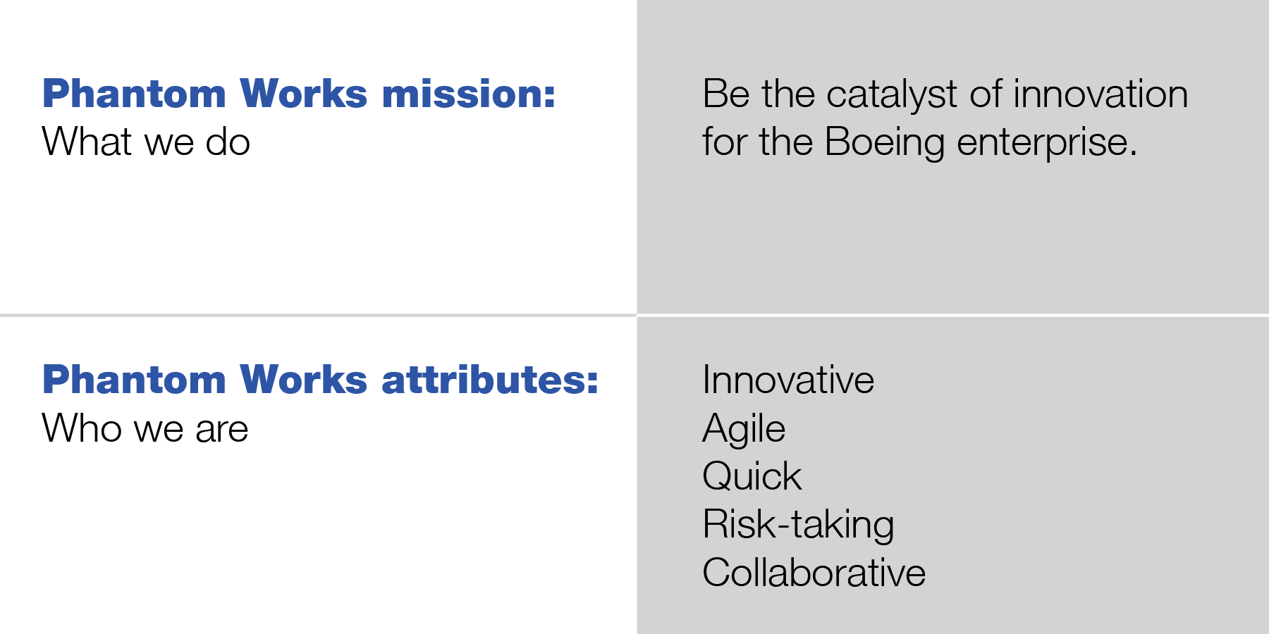
Identity system hierarchy
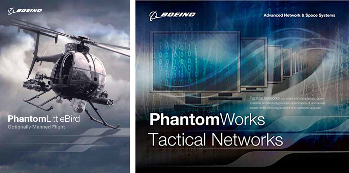
Boeing is a branded house, not a house of brands, so it was clear that Phantom Works needed to fall under the Boeing brand. In the new identity system, Boeing would always be the main focal point. Graphic elements would support the overall Boeing brand while being part of a hierarchy of elements that drove a unique identity within the company. This approach relies on three primary elements: the Boeing logo (always in the leadership position of any design/communication), a standardized product naming convention combined with a fresh, unique use of the Boeing corporate typeface, and finally a new unifying design element — a stylized "P" — which reflects innovation, precision, and aerodynamics.
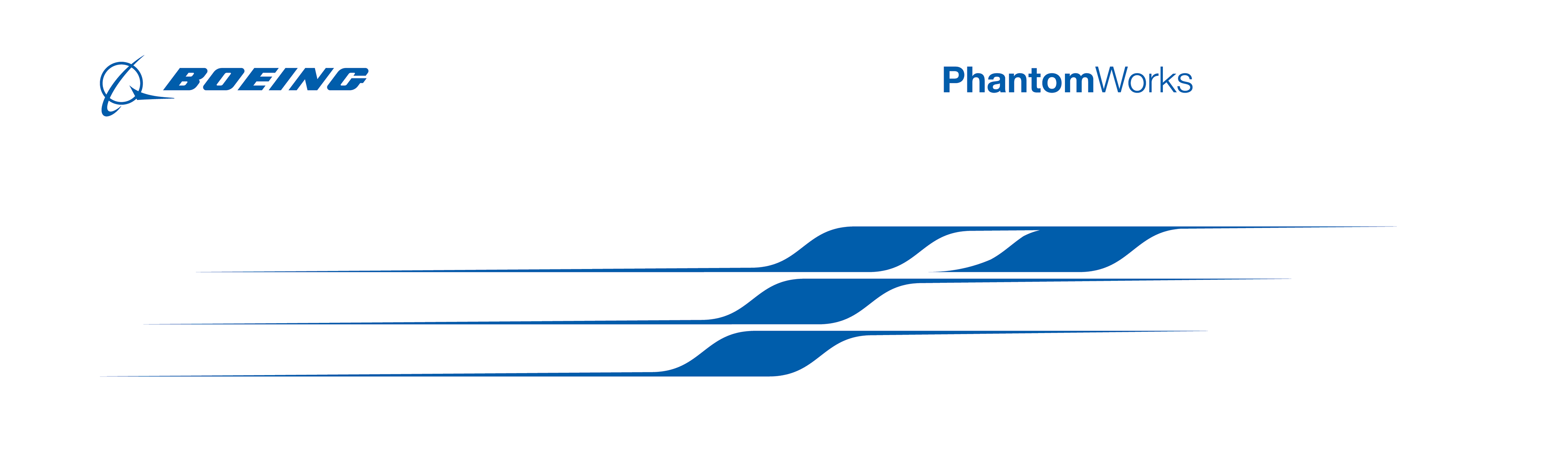
The preferred colors of the stylized "P" are Boeing Blue or gray, which represent the precision, mission-oriented characteristics of the product. The general rule is to place the "P" in blue or gray on a white or semitransparent background. In all deliverables the preferred color palette is white and shades of gray with sparse use of Boeing Blue.
Imagery
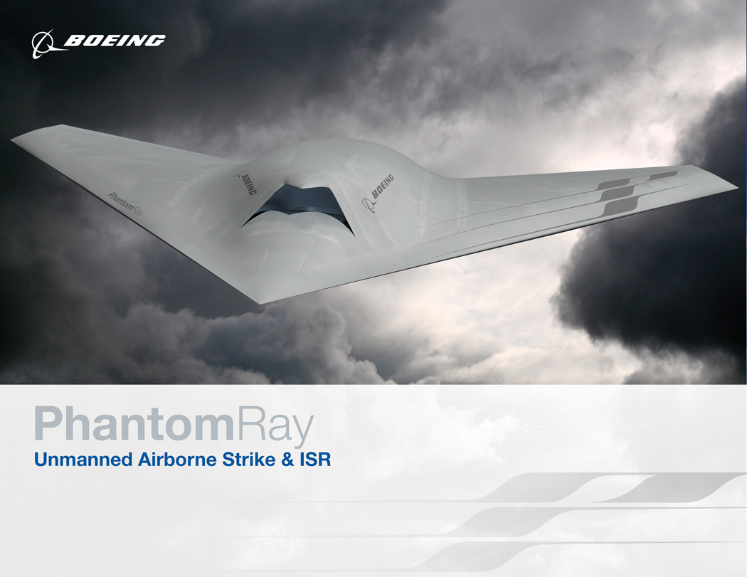
The three primary elements in the Phantom Works system hierarchy are combined to form a vehicle livery style. Each product type is unique. Therefore, the placement of the elements may differ slightly; however, the hierarchy is always maintained.
The general guidelines for placement of design elements are as follows:
• The Boeing logo should go toward the front of the product in the leadership position, for example, the nose.
• The program name is placed more in the center of the product, generally beneath and behind the Boeing logo.
• The stylized "P" generally appears beneath the program name as is scaled accordingly for the size of the program.
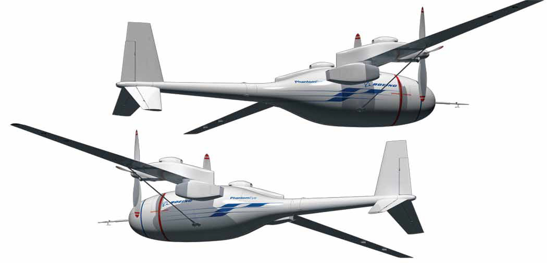
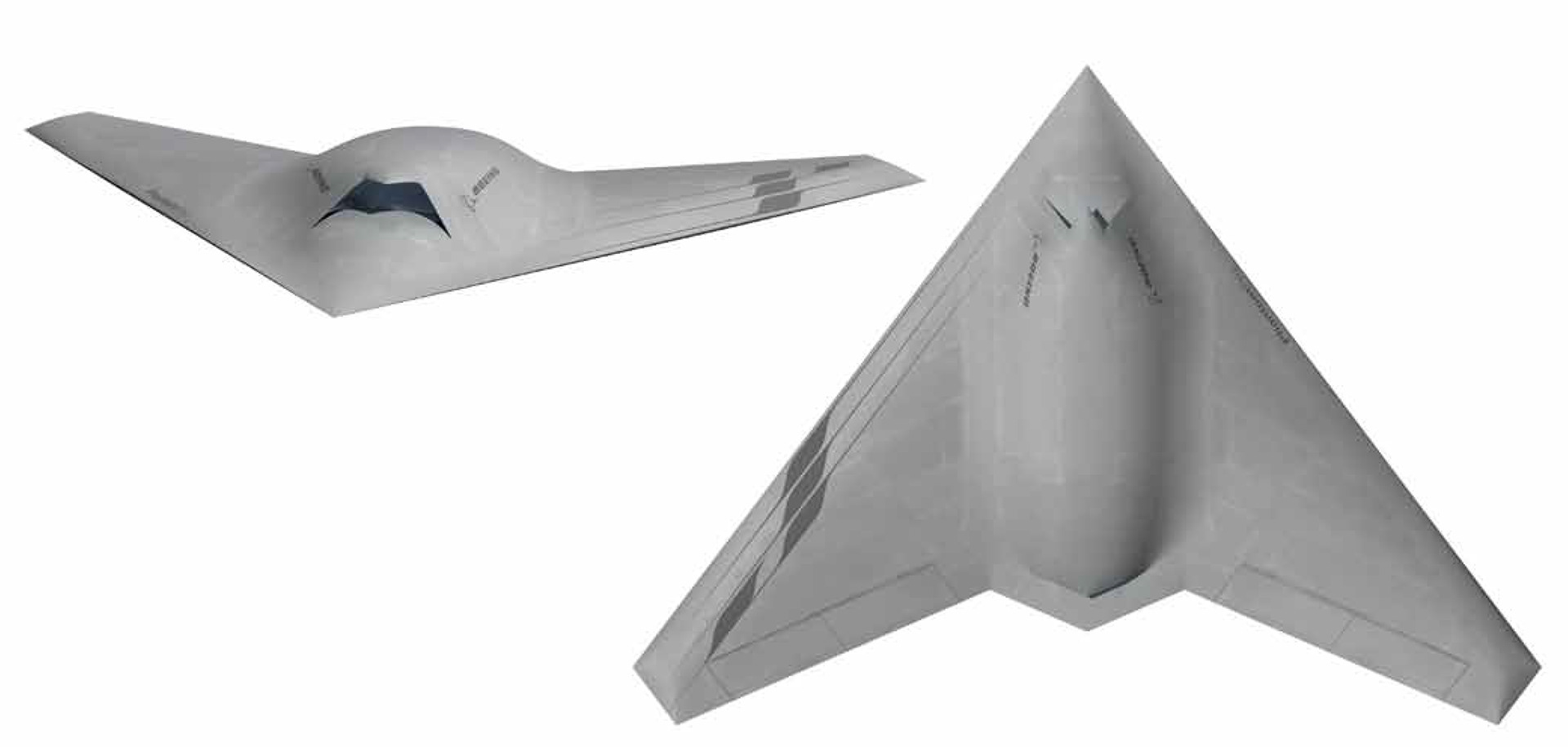
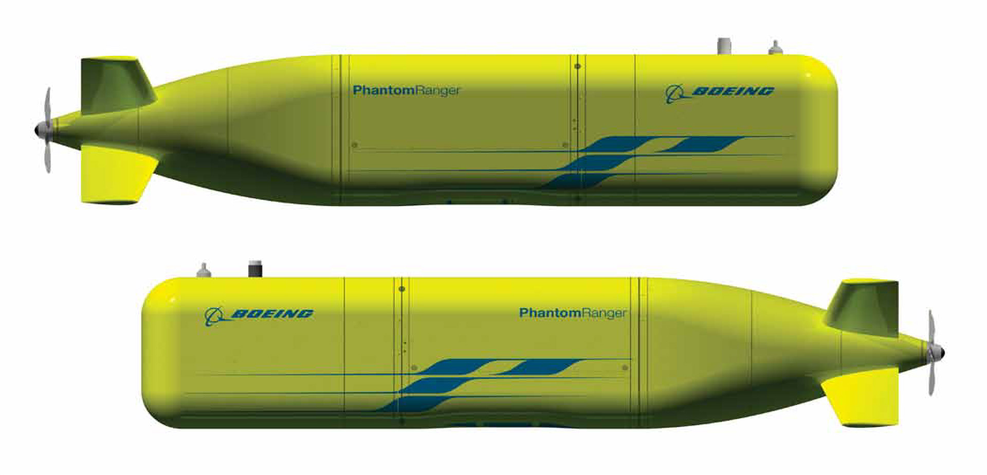
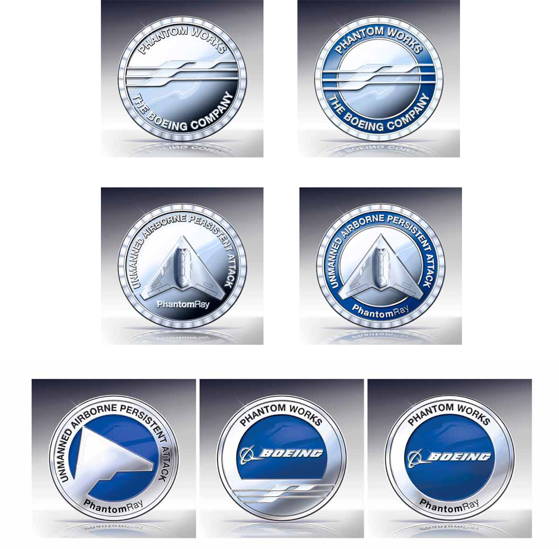
Phantom Works livery samples
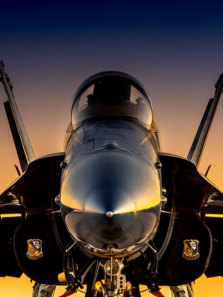
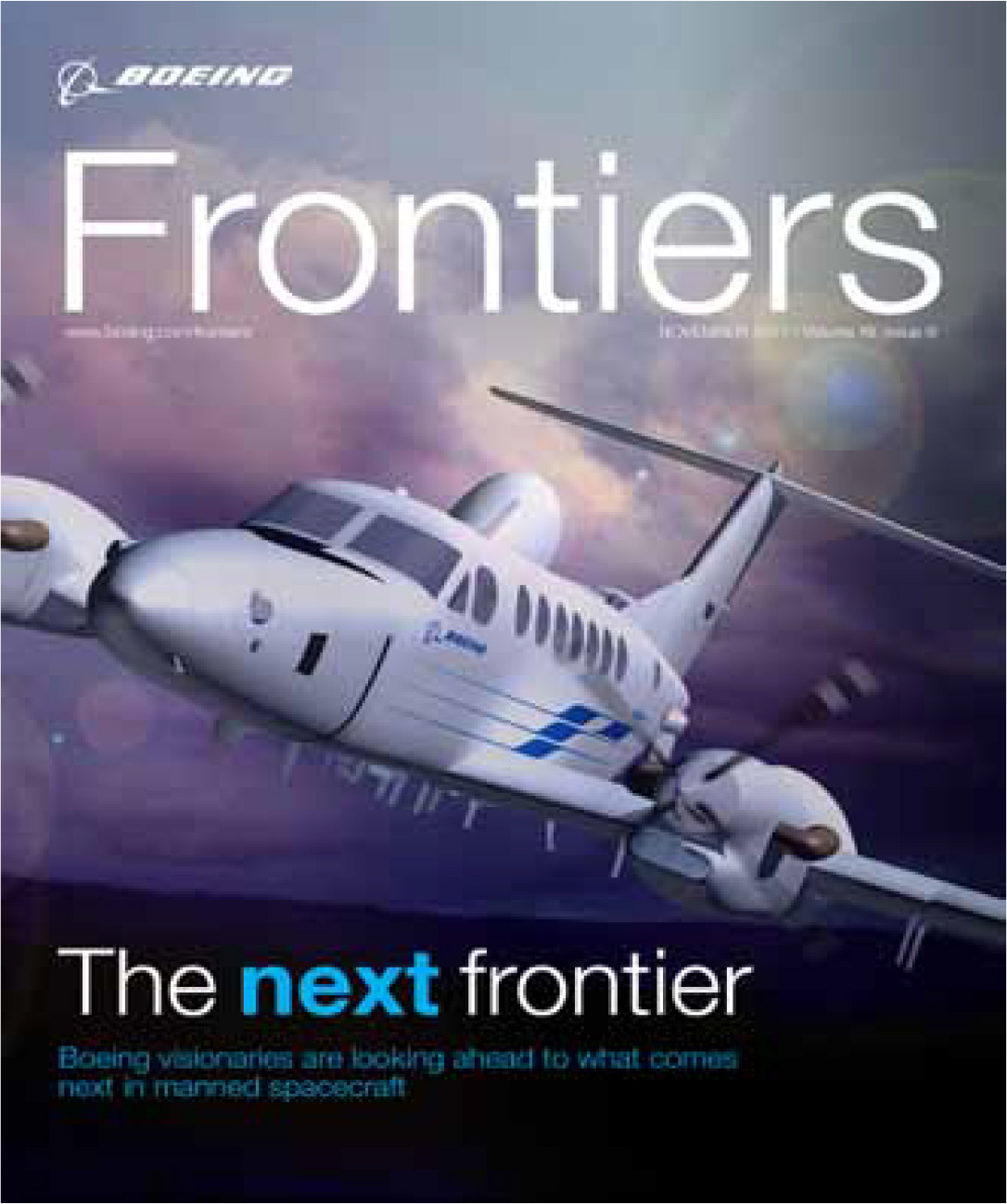
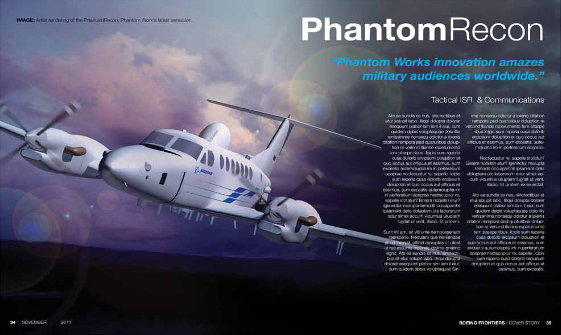
Dynamic photographs and renderings show the applied high-technology aspects of Phantom Works products. High contrast, dramatic angles, and contrasting colors emphasize the active qualities of the products and the enterprising spirit of the brand. In contrast to most Boeing imagery, Phantom Works materials have a more serious mood than those selected for other Boeing image applications. Phantom Works images now reflect that the products are about protecting people in serious situations. More dramatic, darker clouds are used to showcase the products in a more demanding and ominous environment.

The Boeing brand guidelines for logo, typography, and grid would be followed for all publication designs. At the same time, the Phantom Works identity system hierarchy, recommended color palette, and imagery guidelines could be utilized. This allows for the unique Phantom Works identity to be employed while still aligning with the greater Boeing brand.
Results
With a more systematic approach to the Phantom Works identity and a formal Style Guide for all communicators and creative employees to follow, the organization now presents themselves as a more organized and cohesive research team. As a technology provider for the entire Boeing enterprise, with a more unified look and feel aligned under a common set of attributes and singular mission, Phantom Works continues to present Boeing in a positive light that inspires future generations.